CD-01Cards
Flick Card
A two-sided card you spin with a drag or a flick, with thickness, light and a floor shadow that follow the angle.
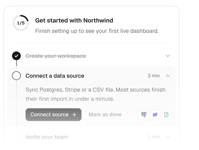
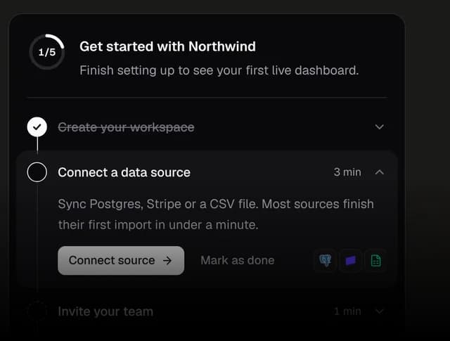
PROOnboarding Checklist and more like it are in Kokonut UI Pro
Installation
Flick Card is a free, open-source React component in the Kokonut UI Cards collection. Add it with the shadcn CLI, which copies the source into components/kokonutui/card-flip.tsx, so the code is yours to change.
npx shadcn@latest add @kokonutui/card-flipUsage
import CardFlip from "@/components/kokonutui/card-flip";

export default function Example() {
  return <CardFlip />;
}
Props
frontReactNodeFront face. Defaults to an event ticket.
backReactNodeBack face. Defaults to the ticket's entry code and seat.
flippedbooleanControlled side: true shows the back.
defaultFlippedbooleanDefault falseStarting side when uncontrolled.
onFlippedChange(flipped: boolean) => voidCalled when a drag, click or key turns the card to the other side.
axisAxisDefault "y""y" spins left and right like a coin, "x" tumbles top over bottom.
labelstringDefault "Event ticket"Accessible name of the card.
classNamestringExtra classes for the root element.
faceClassNamestringClasses for both faces, such as background, border and radius.
Axis
type Axis = "x" | "y";Dependencies
| Needs | Version | Comes from |
|---|---|---|
cn from lib/utils.ts | shadcn init | |
| React | 19 | Your app |
| Tailwind CSS | 4 | Your app |
No provider, font or global CSS to set up: the file works as soon as it lands.